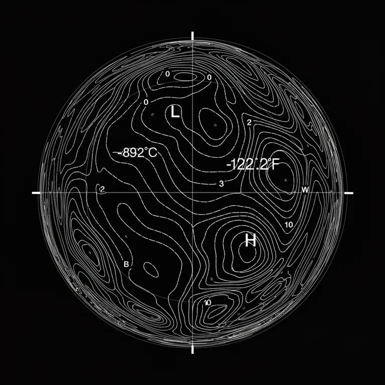

A digital, abstract visualization featuring a spherical, globe-like representation created with contour lines, which appears to depict atmospheric or topographical data. The image uses a monochromatic white-on-black color scheme, giving it a clean, high-contrast appearance reminiscent of scientific diagrams or data visualizations. ### Detailed Description: 1. **Spherical Contour Visualization**: - The main visual element is a sphere represented by a series of interconnected contour lines and dotted curves that outline the surface, giving the impression of a three-dimensional object viewed from above. - The lines are arranged in a spiral or concentric pattern, forming closed loops that indicate varying data levels, possibly representing pressure, altitude, or temperature variations across the surface of the sphere. - The sphere is divided into quadrants by cardinal directions (N, E, S, W), providing orientation and context for the data. 2. **Contour Lines and Markers**: - The white contour lines are solid and evenly spaced, suggesting a smooth gradient or gradual change in the measured parameter. Some lines are tighter and closer together, while others are more spaced out, indicating changes in the slope or intensity of the data. - Two prominent labels are placed within the contour lines: - **"L"** (likely indicating a low-pressure or low-temperature region) is positioned at the top, near the center of the sphere. - **"H"** (likely indicating a high-pressure or high-temperature region) is positioned closer to the bottom, suggesting a dynamic distribution between these points. 3. **Text Annotations and Coordinates**: - Numerical values are displayed at the top left and right corners of the image: - **"-89.2°C"** on the left. - **"-127.2°F"** on the right. - These values might represent extreme temperatures, implying that the visualization could be of a location with very low temperatures, such as a polar region or outer space. - Geographic coordinates are displayed at the bottom of the image: **"78°27'52.1''S, 106°50'02.8''E"**, which places this location in the Antarctic region. This reinforces the interpretation of the image as a depiction of a location with extreme weather conditions. 4. **Line Styles**: - In addition to solid contour lines, there are dotted lines interspersed throughout the image. These dotted lines might represent secondary data points or less prominent variations in the measured field, adding depth and complexity to the visualization. - The contour lines follow the curvature of the sphere, giving the image a sense of depth and three-dimensionality, while still being a flat, two-dimensional representation. 5. **Style and Mood**: - The overall style is modern and technical, focusing on precision and clarity. The monochromatic palette and clean lines make it look like a diagram generated from scientific data or a schematic meant for analytical purposes. - The choice of a black background with white lines adds to the technical and futuristic feel, while the geometric organization of the lines suggests that the visualization is based on a structured dataset. ### Interpretation: The image is likely a representation of atmospheric or geospatial data, possibly showing temperature, pressure, or altitude variations at a specific geographic location. The combination of extreme temperature values and the coordinates pointing to Antarctica suggest that this visualization could be related to weather or climate research, such as a mapping of pressure systems or temperature gradients in polar regions. The aesthetic and visual language of the image give it a high-tech, analytical appearance, making it suitable for scientific presentations, research papers, or educational materials where clarity and precision are paramount. The spherical shape, smooth curves, and data labels all contribute to making this an effective and visually compelling representation of complex information.